The Lorenz Curve Represents The Relationship Between
News Leon
Mar 30, 2025 · 6 min read
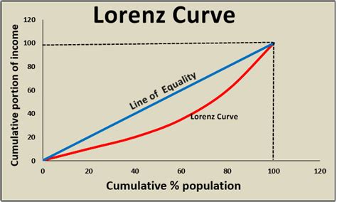
Table of Contents
The Lorenz Curve: Representing Inequality and its Applications
The Lorenz curve, a powerful graphical tool, elegantly depicts the distribution of income or wealth within a population. It reveals the extent of inequality, showing how much of a resource is held by what percentage of the population. Understanding the Lorenz curve's construction, interpretation, and applications is crucial for analyzing economic disparity and informing policy decisions. This article delves into the intricacies of the Lorenz curve, exploring its relationship to inequality, its calculation, its limitations, and its diverse applications across various fields.
Understanding the Lorenz Curve: A Visual Representation of Inequality
At its core, the Lorenz curve represents the cumulative share of a resource (like income or wealth) held by a cumulative percentage of the population. It's a visual representation of the cumulative distribution function (CDF) of the resource in question. A perfectly equal distribution would result in a straight diagonal line, known as the line of equality, where each percentage of the population holds the same percentage of the resource. Any deviation from this line indicates inequality. The greater the curve's deviation from the line of equality, the greater the inequality.
Constructing the Lorenz Curve: A Step-by-Step Guide
Creating a Lorenz curve involves several key steps:
-
Data Collection: Gather data on the distribution of the resource (e.g., income) across the population. This data should be categorized into percentiles or quintiles (fifths) for ease of representation.
-
Cumulative Percentage Calculation: Calculate the cumulative percentage of the population and the cumulative percentage of the resource held by that cumulative percentage of the population. For instance, if the lowest 20% of the population holds 5% of the total income, this represents the first data point on the curve.
-
Plotting the Data: Plot the cumulative percentage of the population on the x-axis and the cumulative percentage of the resource on the y-axis. Each data point represents a cumulative percentile and its corresponding share of the resource.
-
Connecting the Points: Connect the data points to create the Lorenz curve. The curve starts at (0,0) and ends at (100,100).
-
Line of Equality: Draw a straight diagonal line from (0,0) to (100,100). This represents perfect equality.
The resulting graph visually depicts the distribution. A curve hugging the line of equality signifies low inequality, while a curve significantly bowed away from the line indicates high inequality.
Key Metrics Derived from the Lorenz Curve: Quantifying Inequality
While the Lorenz curve provides a visual representation of inequality, several numerical measures help quantify this inequality. The most common is the Gini coefficient.
The Gini Coefficient: A Numerical Measure of Inequality
The Gini coefficient is a summary statistic derived from the Lorenz curve. It ranges from 0 to 1, where 0 represents perfect equality (everyone has the same share) and 1 represents perfect inequality (one person holds all the resources). It's calculated as twice the area between the Lorenz curve and the line of equality. A higher Gini coefficient indicates greater inequality. The formula is often expressed as:
Gini Coefficient = A / (A + B)
Where:
- A is the area between the Lorenz curve and the line of equality.
- B is the area under the Lorenz curve.
Other Measures of Inequality: Exploring Alternatives
While the Gini coefficient is widely used, other measures offer alternative perspectives on inequality:
-
Quintile Ratio: This ratio compares the income share of the highest quintile (top 20%) to the income share of the lowest quintile (bottom 20%). A higher ratio reflects greater inequality.
-
Palma Ratio: This compares the income share of the richest 10% to the poorest 40%. It’s sensitive to changes at the top end of the distribution.
Applications of the Lorenz Curve: Beyond Income and Wealth
The Lorenz curve's applications extend beyond income and wealth distribution. Its versatility makes it valuable across diverse fields:
1. Income and Wealth Distribution Analysis: The Classic Application
The primary application, as discussed earlier, is analyzing income and wealth disparity within a population. This helps identify economic gaps and inform policies to reduce inequality, such as progressive taxation, social welfare programs, and minimum wage legislation.
2. Land Ownership and Resource Distribution: Examining Resource Inequality
The Lorenz curve can effectively analyze land ownership patterns, revealing the concentration of land in the hands of a few. This is especially relevant in developing countries where unequal land distribution can significantly impact agricultural productivity and food security. Similarly, it can study the distribution of other resources like water rights or mineral resources.
3. Healthcare Access and Utilization: Understanding Healthcare Disparities
The Lorenz curve can illustrate disparities in healthcare access and utilization. By examining the distribution of healthcare services across different population segments, it can pinpoint areas requiring intervention to ensure equitable access to healthcare.
4. Educational Attainment and Opportunities: Measuring Educational Inequality
Analyzing educational attainment through the Lorenz curve reveals inequalities in educational opportunities. This can help identify disparities in access to quality education, highlighting the need for policies to promote equal access to education.
5. Environmental Justice: Assessing Environmental Inequality
The Lorenz curve is increasingly used in environmental justice studies to assess the unequal distribution of environmental burdens (like pollution) and benefits (like access to green spaces) across different population groups.
Limitations of the Lorenz Curve: Understanding its Constraints
While the Lorenz curve is a powerful tool, it has some limitations:
-
Sensitivity to Sample Size and Data Accuracy: The accuracy of the Lorenz curve depends heavily on the quality and size of the data used. Inaccurate or incomplete data can lead to misleading interpretations.
-
Lack of Specific Policy Recommendations: The Lorenz curve itself doesn't prescribe specific policies to address inequality. It simply highlights the extent of the inequality. Further analysis and policy discussions are necessary.
-
Ignoring Other Dimensions of Inequality: The Lorenz curve focuses primarily on the distribution of a single resource. It doesn't capture other dimensions of inequality, such as gender inequality, racial inequality, or intergenerational mobility.
-
Aggregated Data: Masking Intra-Group Inequality: The Lorenz curve often uses aggregated data, potentially masking significant inequalities within specific subgroups of the population. For example, a seemingly equal distribution might hide substantial inequality between different racial or ethnic groups.
Conclusion: The Lorenz Curve as a Vital Tool for Understanding and Addressing Inequality
The Lorenz curve provides a compelling and readily understandable visual representation of inequality. Its ability to depict the distribution of various resources across a population makes it a valuable tool for researchers, policymakers, and anyone interested in understanding and addressing societal inequalities. While it has limitations, its strengths in visualizing disparity and facilitating the calculation of key metrics like the Gini coefficient make it an indispensable tool in the ongoing efforts to create a more equitable world. By combining the visual insights of the Lorenz curve with other analytical methods, a more comprehensive understanding of inequality can be achieved, guiding the development and implementation of effective policies aimed at promoting fairness and opportunity for all. Continued refinement of data collection methods and the development of supplementary analytical techniques will enhance the accuracy and usefulness of the Lorenz curve in the future.
Latest Posts
Latest Posts
-
What Is The Formula Of Iq
Apr 01, 2025
-
A Path That An Electric Current Follows Is A
Apr 01, 2025
-
Distance From Earth To Sun Scientific Notation
Apr 01, 2025
-
The Chromosomes Are Aligned At The Spindle Equator During
Apr 01, 2025
-
Integers Are A Subset Of Rational Numbers True False
Apr 01, 2025
Related Post
Thank you for visiting our website which covers about The Lorenz Curve Represents The Relationship Between . We hope the information provided has been useful to you. Feel free to contact us if you have any questions or need further assistance. See you next time and don't miss to bookmark.
