Which Element Explains Symbols And A Maps Use Of Color
News Leon
Mar 16, 2025 · 7 min read
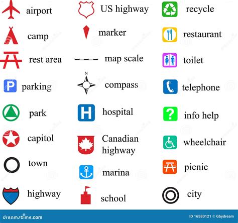
Table of Contents
Which Element Explains Symbols and a Map's Use of Color?
Maps are powerful tools for communication, capable of conveying complex spatial information in a visually accessible format. Central to a map's effectiveness is its strategic use of color and symbols. Understanding how these elements work together is crucial for interpreting maps accurately and creating effective cartographic representations. This article will delve deep into the relationship between color, symbols, and their combined role in map design and interpretation.
The Power of Color in Cartography
Color is arguably the most impactful element in map design. It serves multiple functions, enhancing readability, differentiating features, and conveying meaning. The effective use of color directly impacts the map's overall clarity and effectiveness in communicating geographical data.
Color and Legibility:
-
Contrast: High contrast between different color choices is vital for readability, especially when dealing with small features or densely packed information. Pairing light colors with dark ones, or using complementary colors on the color wheel, maximizes visibility. For example, a dark blue ocean contrasted against a light green landmass ensures easy distinction.
-
Accessibility: Consideration must be given to colorblindness. Many people experience some form of color vision deficiency, primarily red-green or blue-yellow deficiencies. Choosing colors with sufficient perceptual separation, using patterns in conjunction with color, and employing colorblind-friendly palettes are crucial steps towards inclusive map design. Tools and online resources exist to assist with creating colorblind-friendly palettes.
-
Color Saturation and Value: The intensity (saturation) and lightness/darkness (value) of a color significantly affect its legibility. Highly saturated colors can be visually overwhelming, while desaturated colors might be difficult to see. Finding the right balance is crucial for optimal readability.
Color and Categorical Data:
Color is exceptionally useful in representing categorical data—data that is divided into distinct groups or categories.
-
Qualitative Data: For example, different land use types (forests, urban areas, farmland) can be clearly differentiated using distinct colors, allowing for quick visual identification of each category. Choosing colors with enough visual separation between them is key for easy distinction.
-
Choropleth Maps: These maps use color shading to represent data values across geographical areas, such as population density or voting patterns. A color gradient, usually progressing from light to dark, is used to depict variations in the data, with darker shades representing higher values. Choosing a gradient that is both visually appealing and easy to interpret is crucial.
Color and Quantitative Data:
Color can also effectively represent quantitative data—data that can be measured numerically.
-
Sequential Color Schemes: These schemes progress from light to dark or vice versa, representing a continuous range of values, like temperature or elevation. A smoothly transitioning gradient helps visually represent the gradual change in data values.
-
Diverging Color Schemes: These schemes typically use a midpoint, often a neutral color, with colors diverging to both lighter and darker shades on either side. These are ideal for representing data that deviates from a central value, such as temperature deviation from the average or positive/negative changes in a metric.
The Role of Symbols in Map Interpretation
Symbols are graphical representations used to depict features on a map. They are essential for representing objects or phenomena that can't be easily shown through color alone. The effective use of symbols directly contributes to a map's clarity and understanding.
Types of Symbols:
-
Point Symbols: These symbols represent features located at a specific point, such as cities, individual buildings, or wells. Point symbols can be simple (dots, squares) or more complex (icons representing specific types of features).
-
Line Symbols: These symbols depict linear features, such as roads, rivers, or power lines. The thickness, style (dashed, solid), and color of the line symbol can convey additional information, such as road type or river size.
-
Area Symbols: These symbols represent areas or polygons, such as parks, lakes, or countries. They can be filled with a color or pattern, and their boundaries may be represented by lines of varying thickness and style.
Symbol Design Principles:
-
Simplicity: Symbols should be clear and easy to understand, avoiding unnecessary complexity. Simple shapes and icons are often the most effective.
-
Consistency: Consistent use of symbols throughout a map helps maintain clarity. Each symbol should represent the same feature consistently, avoiding ambiguity.
-
Scalability: Symbols should remain legible at different map scales. Overly detailed symbols might lose clarity at smaller scales, while overly simple symbols might lack sufficient detail at larger scales.
-
Meaningful Visual Design: Symbol design should reflect the feature being represented. For example, a tree icon would be a suitable symbol for a forest, while a water droplet icon might represent a well.
Combining Symbols and Color:
The combined use of symbols and color significantly enhances map communication. Color can be used to categorize symbols, highlight specific features, or further differentiate features within a category. For instance, different types of roads (highways, local roads) might be represented by different line symbols and colors.
The Symbiotic Relationship Between Color and Symbols
The power of maps lies in the synergistic relationship between color and symbols. Neither element is truly effective in isolation; their combined use maximizes the map's communicative power.
Color Coding Symbols:
Using color to code symbols enhances the map's readability and the efficiency of information delivery. For example, different types of points of interest (POIs) can be distinguished using different colors and symbols. Parks might be represented by green trees, hospitals by red crosses, and schools by yellow buildings.
Color-Based Hierarchy:
Color can be used to create a visual hierarchy within a map, emphasizing certain features over others. For example, major roads might be represented by thicker, brighter colored lines compared to smaller roads, drawing the viewer's attention to important transportation routes.
Color and Symbol Size:
Combining color and symbol size can enhance the representation of quantitative data. Larger, more intensely colored symbols can represent higher values, while smaller, lighter-colored symbols can represent lower values. This approach adds an additional visual dimension for data representation.
Advanced Cartographic Techniques:
Several advanced cartographic techniques further leverage the power of color and symbols.
Graduated Symbols:
These symbols vary in size proportionally to the data they represent, creating a visual hierarchy based on magnitude. For instance, cities could be represented by circles whose sizes correlate with their population. Combining graduated symbols with color can add further clarity, as different categories might use different colors.
Isarithmic Maps:
These maps use lines (isopleths) to connect points of equal value, such as elevation contours or temperature isotherms. Color can be used to enhance these maps by shading areas between isopleths, creating a visual representation of the data's spatial distribution.
Dot Density Maps:
These maps use dots to represent the density of a phenomenon, such as population distribution. The density of dots in a given area visually conveys the concentration of the phenomenon. Color can be used to represent different categories within the dot density map.
3D Mapping and Color:
With the rise of 3D mapping technologies, color plays an even more crucial role in representing spatial data. Color can be used to depict elevation, depth, or other dimensions, adding depth and realism to the visualization.
Conclusion: The Art and Science of Map Design
The effective use of color and symbols is not merely a matter of aesthetics; it is a fundamental aspect of effective map design. By understanding the principles of color theory, symbol design, and the interplay between the two, cartographers can create maps that are both visually appealing and highly informative. The strategic use of color and symbols allows for clear communication of complex spatial information, making maps indispensable tools for understanding our world. Continuous exploration of new techniques and technologies further enhances the power of color and symbols in cartography, pushing the boundaries of visual representation and communication. The combined use of these elements results in maps that are not only informative but also engaging and memorable. Remember, a well-designed map isn't just a visual representation; it's a story told through visual language, and color and symbols are the key components in crafting that narrative.
Latest Posts
Latest Posts
-
What Is The Iupac Name For The Following Alkane
Mar 16, 2025
-
Select The Correct Statement About Active And Passive Immunity
Mar 16, 2025
-
Which Electronic Device Would Be Considered A Node
Mar 16, 2025
-
Number Of Electrons In Carbon Atom
Mar 16, 2025
-
Number Of Seconds In A Week
Mar 16, 2025
Related Post
Thank you for visiting our website which covers about Which Element Explains Symbols And A Maps Use Of Color . We hope the information provided has been useful to you. Feel free to contact us if you have any questions or need further assistance. See you next time and don't miss to bookmark.
