What Does The Shaded Area On The Map Show
News Leon
Mar 16, 2025 · 7 min read
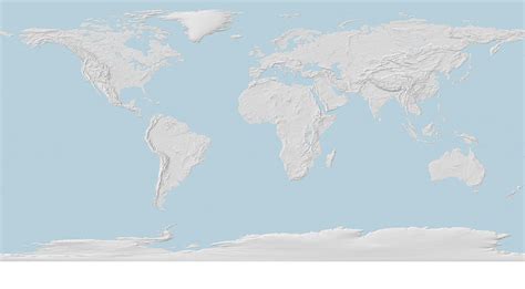
Table of Contents
What Does the Shaded Area on the Map Show? Decoding Geographic Representations
Maps are fundamental tools for understanding our world. They condense vast geographical information into easily digestible visuals, allowing us to navigate, analyze, and compare different regions. However, the effectiveness of a map hinges on our ability to interpret its elements, particularly those visual cues like shading, color, and symbols. This article dives deep into the meaning behind shaded areas on maps, exploring the various types of shading techniques and the diverse information they convey.
Understanding the Purpose of Shading on Maps
Shading, or the use of different tones or colors, is a powerful cartographic technique used to represent a wide array of geographic data. It's a visual shorthand that allows mapmakers to communicate complex information quickly and effectively. Instead of relying solely on labels and numbers, shading helps to highlight patterns, trends, and variations across a geographical area. This visual representation makes it easier for the viewer to grasp the overall distribution and intensity of the represented phenomenon.
Think about a world map showing population density. Instead of listing population figures for each country, a shaded map uses varying shades of color (e.g., darker shades for higher population density, lighter shades for lower density) to instantly convey the global distribution of people. This visual approach makes the information more accessible and memorable than a table of raw data.
Types of Shading and Their Significance
The type of shading used on a map is crucial in deciphering its meaning. Different techniques serve different purposes and convey different types of information. Let's examine some common shading methods:
1. Choropleth Maps: Showing Quantitative Data Across Areas
Choropleth maps are perhaps the most common type of shaded map. They use different shades of a single color or a series of colors to represent the values of a particular variable across different geographical units, such as countries, states, or counties. The darker the shade, the higher the value of the variable. Examples include:
- Population Density: Darker shades represent areas with higher population density.
- Income Levels: Darker shades indicate areas with higher average income.
- Voter Turnout: Darker shades represent areas with higher voter participation.
- Disease Prevalence: Darker shades denote areas with a higher incidence of a particular disease.
Understanding Choropleth Limitations: It's crucial to remember that choropleth maps represent aggregated data. They show the average value for a given area, masking internal variations within that area. For example, a county shaded dark might have pockets of high and low values within its boundaries.
2. Isopleth Maps: Representing Continuous Data with Contour Lines
Unlike choropleth maps that focus on discrete geographical units, isopleth maps represent continuous data using contour lines. These lines connect points of equal value, creating a visual representation of gradual changes in a variable across space. Examples include:
- Elevation: Contour lines on topographic maps connect points of equal elevation, allowing us to visualize mountains, valleys, and slopes.
- Temperature: Isopleths can show the distribution of temperature across a region, highlighting areas of similar temperature.
- Precipitation: These maps display areas with equal rainfall amounts, revealing patterns of wet and dry regions.
- Air Pollution: Isopleths can map the concentration of pollutants, indicating areas with high and low pollution levels.
Interpreting Isopleths: The closer the contour lines are together, the steeper the gradient of the variable. Widely spaced lines indicate a gradual change.
3. Dot Density Maps: Visualizing the Concentration of Features
Dot density maps use dots to represent the presence of a particular phenomenon. The density of the dots reflects the concentration of the feature. A higher concentration of dots indicates a higher density of the feature. Examples include:
- Population Distribution: Each dot might represent a certain number of people, allowing for a visual representation of population clustering.
- Business Locations: Dots can represent the location of businesses, showing their spatial distribution.
- Tree Coverage: Dots can represent individual trees, illustrating forest density.
Effective Dot Density: The size and spacing of dots are crucial for accurate representation. Too many dots can make the map cluttered, while too few can obscure the pattern.
4. Shaded Relief Maps: Emphasizing Topography
Shaded relief maps use shading to emphasize the three-dimensional form of the land surface. They create a realistic visual effect by simulating the way light falls on the terrain. This technique allows viewers to easily understand the topography, including mountains, valleys, and plains. These maps are often used in combination with other map types to enhance their visual appeal and informational clarity.
Importance of Light Source: The direction of the simulated light source influences the appearance of the shaded relief. Understanding this is critical for accurately interpreting the topography.
Decoding Specific Shaded Areas: Examples and Interpretations
To further clarify the interpretation of shaded areas, let’s look at specific examples:
Example 1: A Map Showing Rainfall Distribution:
A map showing rainfall distribution might use different shades of blue to represent different rainfall amounts. Darker shades of blue indicate higher rainfall, while lighter shades indicate lower rainfall. Areas with no shading might represent arid or desert regions with minimal rainfall. This map allows for easy identification of wet and dry regions, potentially revealing information about climate patterns, agricultural suitability, or flood risks.
Example 2: A Map Showing Election Results:
A map showing election results might use different shades of red and blue to represent the winning candidate in different districts or states. The intensity of the color could also reflect the margin of victory, with deeper shades indicating a stronger win. This type of map effectively displays the geographic distribution of political support and identifies regions of strong support for each candidate.
Example 3: A Map Showing Air Quality Index:
A map showing the Air Quality Index (AQI) might use different shades of gray or color gradients to indicate the severity of air pollution. Darker shades might represent areas with unhealthy air quality, requiring viewers to take precautions. Lighter shades would indicate areas with better air quality. This type of map is crucial for public health, allowing individuals to understand pollution levels in their areas and take necessary protective measures.
Example 4: A Map Showing Elevation:
Topographic maps use contour lines and shading to depict elevation. Different shades might represent different elevation ranges, with darker shades representing higher elevations and lighter shades representing lower elevations. This type of map helps visualize the terrain, identify mountains, valleys, and slopes, and is instrumental for planning infrastructure projects or outdoor activities.
Beyond Simple Shading: Advanced Techniques and Considerations
Modern cartography uses more sophisticated shading techniques, incorporating advanced data visualization methods to improve clarity and understanding.
- Graduated Symbols: Combining shading with graduated symbols (e.g., circles of varying sizes) allows for representing multiple data points within a single geographical unit.
- 3D Rendering: Using 3D modeling and rendering techniques allows for the creation of highly realistic and informative shaded maps, especially for visualizing terrain and complex datasets.
- Interactive Maps: Online maps often incorporate interactive elements, allowing users to explore the shaded areas in detail, access underlying data, and zoom in or out to reveal finer-grained information.
Critically Analyzing Shaded Maps:
It's essential to approach shaded maps critically. Always consider the following:
- Data Source: Understand the source of the data used to create the map. Is it reliable and accurate?
- Map Projection: The projection used can distort the shape and size of geographical areas, affecting the interpretation of shading.
- Legend: Carefully examine the map legend to understand what the different shades represent.
- Spatial Resolution: The level of detail affects the accuracy of the representation. High-resolution maps provide more detail, while low-resolution maps provide a broader overview.
- Context: Consider the context of the map and the purpose for which it was created. This will help in interpreting the information presented.
Conclusion: Unlocking the Secrets of Shaded Maps
Shaded areas on maps are far more than just visual elements; they are powerful tools for conveying complex geographical information. By understanding the various shading techniques and considering the context of the map, we can effectively interpret the data presented and gain valuable insights into the spatial distribution of numerous phenomena. Whether it's population density, rainfall patterns, or air quality, mastering the art of interpreting shaded maps empowers us to better understand our world and make informed decisions based on geographical data. Remember to always approach map interpretation with a critical eye, considering the data source, projection, and context to ensure accurate understanding.
Latest Posts
Latest Posts
-
How Many Feet Is 1 2 Miles
Mar 18, 2025
-
How Many Valence Electrons Does Mn Have
Mar 18, 2025
-
Lines Of Symmetry On A Trapezoid
Mar 18, 2025
-
Two Same Words With Different Meanings
Mar 18, 2025
-
Select The Correct Statement About Equilibrium
Mar 18, 2025
Related Post
Thank you for visiting our website which covers about What Does The Shaded Area On The Map Show . We hope the information provided has been useful to you. Feel free to contact us if you have any questions or need further assistance. See you next time and don't miss to bookmark.
